
Scatterplot with regression line (blue). Vertical black lines represent residuals.
Getting started
Today, we will learn how to:
- Plot and summarise the relationships between continuous variables.
- Interpret regression models
- Think about which variables we should adjust for in regression models
- Interpret the model fit and summary statistics of models.
We will be leaning on the finalfit and car libraries to do these analyses.
Before we start
We’ll be working on the cot death data again, which on a case-control study. The critical elements of a case-control study are the definition of cases and controls (the disease), and the potential exposures.
Here, we will be focusing on the relationships between continuous variables, such as:
Gestation at which the baby was born (weeks)
Birth weight of the baby in grams
The mother’s age in years
Although these were not the primary aim of the study, we can nevertheless look at these relationships using regression.
When it comes to analysing continuous outcomes, for binary categorical exposures, we can use t-tests, however, if we have continuous exposures, we really need regression, and if we have more than two groups, we use a special type of regression called ‘ANOVA’ or analysis of variance. Today, we will be using linear regression, which is most often used for continuous outcomes that are not counts. For count data, we usually use Poisson regression or a variant on this theme.
Set-up

Yak shaving: Photo by Jason An at Unsplash.com
To set-up our session for analysis and call the necessary libraries. Note, that I’m using pacman::p_load() in place of install.packages() and library(). The pacman library shortens this procedure, and p_load() will look for a package and install it if it can’t be found on the machine. It will also put it on the search path, like the library() command does. These tutorials don’t allow loading or installing packages for security reasons, so the code is given below for reference.
if(!require(pacman)) install.packages("pacman")

pacman::p_load(rio, ## package for importing data easily
               visdat, skimr, # data exploration
               car, #fancy plots
               httr,
               ggplot2, #fancy plots
               dplyr,
               rmdHelpers,
               kableExtra,
               epiDisplay,
               finalfit) # This is for making regression tables.
We will assume we have imported our data, corrected errors and checked for duplicates just as we have done in previous sessions. We won’t repeat it here! 🥱
Let’s crack on!🤠
Scatter plot
We want to know whether the length of time a woman is pregnant (gestation) influences the birth weight of their child.
First of all, let’s examine the crude relationship with some plots. When you have both a continuous exposure and outcome, then a scatterplot is the most appropriate. A scatterplot alone is difficult to interpret, so it is worthwhile adding a regression line and a smoother. Traditionally, the outcome is on the vertical or y-axis, and the exposure is on the horizontal or x-axis.
NB: A frequent error students make is mixing up the \(x\) and \(y\) axes between exposures and outcomes.
The car::scatterplot() function does all this by default. The slope of the line gives an indication of the strength of association.
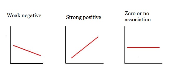
Regression line meanings
car::scatterplot(Birth_wt ~ Gestation, data = df)Question
We can also account for other variables. If Mother_smoke is thought to be an important variable, since babies of smokers are known to be low birth weight, we can stratify our plot by smoking.
car::scatterplot(Birth_wt ~ Gestation | Mother_smoke, data = df)We can also add units to our \(x\) and \(y\) axes by adding some additional arguments to the function call (xlab and ylab).
car::scatterplot(Birth_wt ~ Gestation | Mother_smoke, data = df,
xlab = "Gestation (weeks)", ylab = "Birth weight (grams)")
Questions
Run code to produce a scatter plot of the association between gestation period (Gestation; independent variable) and birth weight (Birth_wt; dependent variable), stratified by ethnic group (Ethnic). Use the code format given.
# car::scatterplot(y ~ x | group, data = dataset)car::scatterplot(Birth_wt ~ Gestation | Ethnic, data = df)Hint: What are y, x, group and dataset for this question?
(Hint: Look at where each regression line starts (left-hand side) and ends (right-hand side))
Crude Linear Regression model
To estimate the strength of association between birth weight and gestational age, run the following code:
model <- lm(Birth_wt ~ Gestation, data = df)
summary(model)
The first line creates the model object and the second prints a summary of the model.
The line of the model is defined by 2 major parameters:
- slope
- y-intercept
The Estimate column gives two parameters:
- (Intercept) is the \(y\)-intercept or average value of \(y\) when \(x\) is 0. - Gestation is the slope or \(\beta\) coefficient, which indicates the average change in \(y\) for a one unit change in \(x\). 🥸
Questions
The R-squared gives you an idea of how much variation is explained by the model. It is the proportion of variation explained by the model compared to that of the simplest possible model, a mean of Birth_wt in this example. Values close to one indicate good model fit and values close to zero indicate poor fit.
The Pr(>|t|) gives you the \(P\)-value, testing whether each parameter is significantly different from a value of zero. Remember, a slope of zero is a horizontal line, and indicates no association or the null hypothesis or independence between the two variables. The standard error can be used to estimate the 95% confidence interval (95% confidence interval = slope +/- 1.96*standard error). Remember, 1.96 is the 97.5th percentile of the standard normal distribution curve. It is calculated in R using the following code:
qnorm(0.975, mean = 0, sd = 1)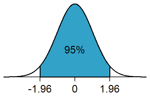
The Residual standard error, despite it’s name, is actually the standard deviation of the residuals and tells you about the average variation which occurs around the regression line. Unlike the standard error, it is not influenced by sample size.
Questions
Look at your model summary output and answer the questions below.
Adjusting for confounding: multiple linear regression
Let’s imagine now that we wish to account for maternal smoking (Mother_smoke), since we believe it is a shared common cause of both the outcome (Birth_wt) and the exposure (Gestation). This is the definition of a confounder. We simply add Mother_smoke as another term in the right-hand side of the equation for the model.
model <- lm(Birth_wt ~ Gestation + Mother_smoke, data = df)
summary(model)
Questions
Gestation changed with the addition of Mother_smoke? Enter a value (to 1 decimal place) here:
5.6Hint: What’s the difference between the crude and adjusted coefficients?
Mother_smoke and Birth_wt?
model <- lm(Birth_wt ~ Gestation + Mother_smoke, data = df)
summary(model)
model <- lm(Birth_wt ~ Mother_smoke, data = df)
summary(model)Hint: Get rid of the other exposure: here Gestation so the association is no longer adjusted for by this extra variable.
Mother_smoke and Birth_wt)? (Hint: a scatter plot is not going to be the best choice here! You may have to think back to past lectures!).
Hint: use the function boxplot(Continuous_outcome_variable ~ categorical_exposure_variable, data = df). Adjust the variable names!
boxplot(Birth_wt ~ Mother_smoke, data = df)Extra practice!
Construct a linear model for the association betweenGestation (independent variable) and birth weight (Birth_wt; dependent variable), adjusted for ethnicity (Ethnic). Modify the code given below.
model <- lm(y ~ x1 + x2, data=dataset)
summary(model)
model <- lm(Birth_wt ~ Gestation + Ethnic, data = df)
summary(model)Hint: - replace y, x1, x2 and dataset with appropriate names - then press submit.
Confidence intervals of predictions from linear models
As we have shown, you can make predictions from linear models with a bit of simple algebra. Things get a bit more complicated when we want to estimate a plausible range of values for our predictions. We have to decide whether the prediction relates to a mean or an observation. The mean value of birth weights and 95% confidence intervals, say of the birth weight of a group of the offspring of Māori women at 37 weeks gestation is given below.
## Confidence interval (mean value)
model <- lm(Birth_wt ~ Gestation + Ethnic, data = df)
predict(model,
        newdata = data.frame(Ethnic = "Maori", Gestation = 37),
        interval = "confidence") |> round(0)
## fit lwr upr
## 1 2795 2745 2845Contrast this with the range of predicted values for an individual Māori woman’s Birth_wt of their child with the same characteristics. This is often called a prediction interval to distinguish it from a confidence interval.
## Prediction interval (variability for an individual)
model <- lm(Birth_wt ~ Gestation + Ethnic, data = df)
predict(model,
        newdata = data.frame(Ethnic = "Maori", Gestation = 37),
        interval = "prediction") |> round(0)
## fit lwr upr
## 1 2795 1880 3711The latter has a wider interval, as the calculation has to incorporate the uncertainty in the residuals as well as the intercept and slope, whereas the former assumes that the mean of the residuals is zero and therefore can be ignored.
Using finalfit() for publication quality regression tables
In epidemiology, it is usual to present a second table after your table 1. For the table one we used arsenal::tableby(). Here, we will use finalfit. We have to tell finalfit() which variables are our explanatory or exposure variables and which is the dependent or outcome variable. This is usually a table of regression coefficients and 95% confidence intervals, and \(P\)-values. It usually has crude and adjusted \(\beta\) coefficients. The following code will help us here:
## explanatory variables are exposures of interest and confounders.
## Also known as 'predictors'
explanatory <- c("Mother_age", "Mother_smoke", "Gestation", "Ethnic")

## this is the outcome
dependent <- "Birth_wt"

## This little bit of code saves a world of pain and runs
## all the crude and adjusted models and summarises into
## a table. Wonderful...!!
## Note: finalfit() will select the appropriate model
## depending on the nature of the outcome variable
## Here: continuous or numeric variable = linear regression.
## You have to be cautious about this, as the selected model may not be
## the one you are intending to use. Be careful and study the
## finalfit() documentation when you are using this in the wild!

df |>
  finalfit::finalfit(dependent,
                     explanatory, metrics = FALSE) -> regression_table

## Fancy format for cutting and pasting into Excel
regress_tab <- knitr::kable(regression_table, row.names = FALSE,

                            align = c("l", "l", "r", "r", "r"))

## Puts output into viewer so that it can be cut and pasted into Excel,
## then Word.
regress_tab |> kableExtra::kable_styling()
Questions
What is the mean difference in birth weight of smokers’ babies, compared to non-smokers’, after accounting for confounders?191185.31126Hint: The Māori and Pacific coefficients are both being compared with European. So you need to combine them in some way
In the code below, to produce model metrics change metrics from FALSE to TRUE. You will also need to specify the dependent and explanatory variables.
df |>
  finalfit::finalfit(dependent,
  explanatory, metrics = FALSE) -> regression_table

# print output
# This is regression table
regression_table[[1]]

#These are metrics
regression_table[[2]]
Hint: Add in same dependent and explanatory variables as for the first finalfit() example. Change metrics = TRUE to metrics = FALSE.
explanatory <- c("Mother_age", "Mother_smoke", "Gestation", "Ethnic")

dependent <- "Birth_wt"

df |>
  finalfit::finalfit(dependent,
  explanatory, metrics = TRUE) -> regression_table

# print output
# This is regression table
regression_table[[1]]

#These are metrics
regression_table[[2]]0.44Model fit
How well a model fits the data can be assessed with a marginal model plot, which shows the relationship between the model predicted and observed data.
Run this code to produce a marginal model plot:
model <- lm(Birth_wt ~ Gestation + Mother_age, data=df)
summary(model)

car::marginalModelPlots(model) # Produces a marginal model plot
What is the nature of the overall fit of the model to the data? - A good fit is indicated by good alignment between Data (blue line) and the Model (red line). That is, with perfect model fit, you should see both lines very close or superimposed on each other. - Poor fit is indicated by poor alignment between these lines. - Often, you see that for more extreme or outlying values of an exposure, there is deviation of the Data from the Model. This may not invalidate your model, but would be important to be aware of, and may be worthwhile highlighting to the readers that you are communicating with in your manuscript.
Questions
We want to construct a marginal model plot for the association between Gestation and Birth_wt, adjusted for ethnic group. A potential problem with car::marginalModelPlots() is that it throws a wobbly if character variables are put into regression models. Although the modelling function (lm()) might work fine, the plot function (car::marginalModelPlots()) won’t.
Before we do so, use the str() function, with the code format given, to check what sort of variable Ethnic is (character or factor).
dataset$variable |> str()df$Ethnic |> str()Hint: What should you replace dataset and variable with?
If df$Ethnic is a character variable, you need to first convert it to a factor variable, rerun the model function call and then the plot function. Adapt the code below to model the relationship between Birth_wt (outcome) and Gestation and Ethnic (exposures) so that it produces an appropriate diagnostic plot.
dataset$ethnic <- dataset$ethnic |> as.factor()
model <- lm(Birth_wt ~ Gestation, data=df)
car::marginalModelPlots()
dataset$Ethnic <- dataset$Ethnic |> as.factor()
model <- lm(Birth_wt ~ Gestation + Ethnic, data = df)
car::marginalModelPlots(model)Hint:
Line 1: What should dataset be? What goes after $?
Line 2: Change code so that Ethnic is adjusted for
Line 3: What goes in the brackets?
Homework
Is the duration of pregnancy influenced by the mothers’ age?
Run a regression model to find out.
To find out, repeat the above tasks with Mother_age as the exposure and Gestation as the outcome.
Summary
Congratulations! We’ve covered a lot of material on linear regression in this session.
Key Concepts I’ve Learned
- Scatterplots show the relationship between continuous variables visually
- Linear regression models the relationship between a continuous outcome and one or more exposures
- Slope (β coefficient) tells us the average change in the outcome for a one-unit increase in the exposure
- Multiple regression allows us to adjust for confounders when examining exposure-outcome relationships
- Model diagnostics help us check if our regression assumptions are met
- Prediction allows us to estimate expected outcomes for specific exposure values
Key R Libraries I’ve Learned
car- for creating scatterplots with regression lines and model diagnosticsfinalfit- for creating publication-ready regression tables with crude and adjusted estimateslearnrandgradethis- for interactive tutorial exercises
Essential R Commands I’ve Practiced
Visualization: - car::scatterplot(y ~ x, data = df) - create scatterplots with fitted regression lines - car::scatterplot(y ~ x | group, data = df) - scatterplots with separate lines by groups - boxplot(y ~ x, data = df) - compare continuous outcomes across categorical groups
Building regression models: - lm(y ~ x, data = df) - fit a simple linear regression model - lm(y ~ x1 + x2, data = df) - fit multiple regression with several exposures - summary(model) - display regression coefficients, p-values, and R-squared - coef(model) - extract regression coefficients - confint(model) - calculate 95% confidence intervals for coefficients
Making predictions: - predict(model, newdata = data.frame(x = value)) - predict outcomes for specific exposure values
Model diagnostics: - car::marginalModelPlots(model) - check model fit with diagnostic plots - as.factor() - convert character variables to factors for certain functions - str() - check variable types before modeling
Publication tables: - finalfit::finalfit(dependent, explanatory) - create tables with crude and adjusted estimates - knitr::kable() and kableExtra::kable_styling() - format tables for export
Key Formula Notation
y ~ x- outcome on the left, exposure on the righty ~ x1 + x2- multiple exposures added with+y ~ x | group- stratified by group (for certain plotting functions)
Ensure you can interpret the output.